| typography | ||||
|
|
Formal & informal typography & lettering in print and online | |||
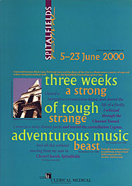 I have designed publicity and the programme book for Spitalfields Festival since the mid 1990s - the lettering for the logo is also mine. The current style is more image-based (see ). |
Typography is at the core of most of my work, and I take great pleasure in organising words on the page or screen.
I started professional life using hot metal typesetting and paste-up, frequently designing in two colours. Working with printers, I learned how important it is to know about production methods, a lesson which applies to any medium. I bought my first Mac system many years ago, a 4/40 with monochrome monitor and a laser printer. I was lucky to be teaching at Middlesex University at the time, where I could pick brains and begin to work out how to make the computer do what I wanted, rather than what its defaults dictated. I now use QuarkXPress, InDesign (when I have to), FreeHand, Photoshop, PageSpinner and other, less standard, applications. Pink numbers will open larger versions and/or more examples in a viewer window. |
|||
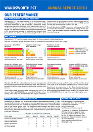 Annual report for Wandsworth PCT. Spiral bound at the top, it opened one way to the report itself, from the other side to a calendar which included profiles of staff and PCT initiatives.
|
||||